Announcement bar

Section settings#
General settings#
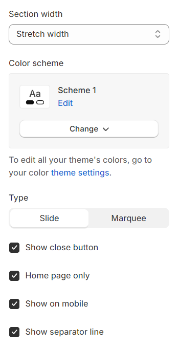
Section width: You can choose among Fluid Container, Stretch width, Full width for the layout or just leave it with the default layout.
Color scheme: You are allowed to change text color, background color, etc. with preset color.
Type: Select between slide and marquee.
Show close button: Include a close button, marked with an "X" icon, for user convenience.
Home page only: Choose whether to display the feature exclusively on the home page or on all pages.
Show on mobile: Determine if this feature should be visible on mobile devices.
Show separator line: Decide to show the separator line on which page.
Action: Select the type of action for displaying the feature, with options including an animation marquee or a slider, to enhance the visual experience on your site.
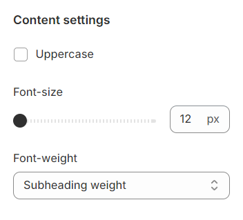
Content settings#
Uppercase: Convert content to uppercase.
Font setting: Adjust the font settings by choosing a specific font size and weight for readability and visual impact.
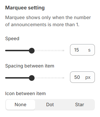
Marquee setting#
Speed: Set the duration for the marquee animation to ensure smooth scrolling.
Spacing between items: Manage the spacing between two announcements within the marquee to maintain clarity and aesthetic balance.
Icon between items: Control the icon that appears between two announcements in the marquee.
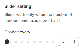
Slider setting#
You can set the duration for the slide before it transitions.
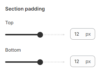
Section padding#
Section padding allows you to specify the space between this section and the preceding or following sections, or both.
Block settings#
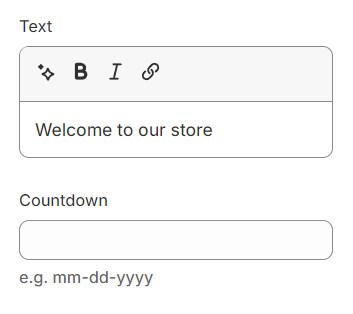
Here, you can set the text displayed in each block. Additionally, you can include a countdown timer for any information within the block.
Last updated 1 year ago