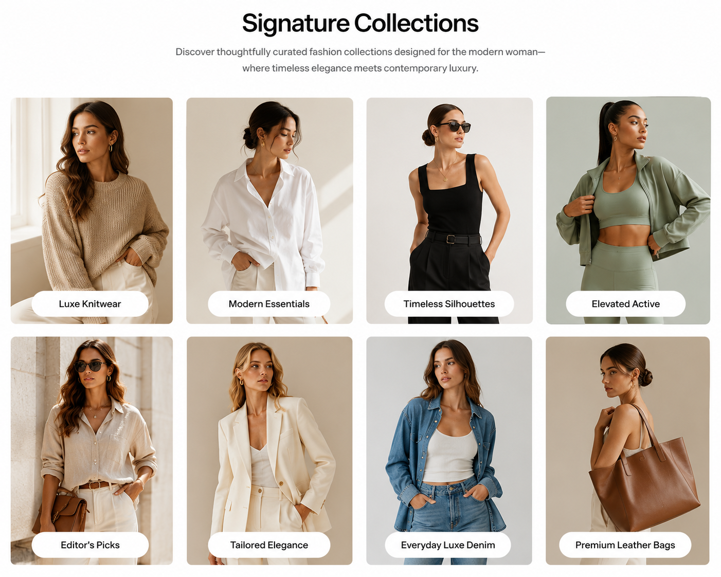
Collections list page
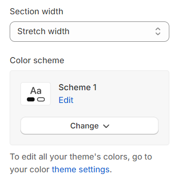
Section settings#
General#
Section width: You can choose among Fluid container, Full width, Stretch width for the banner layout.
Color scheme: Set text color and background color with preset scheme
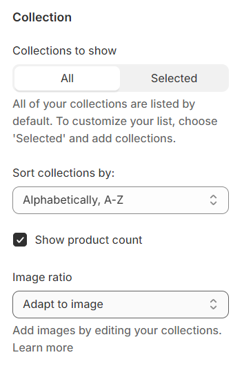
Collection#
Collections to show : Choose to display all collections or only selected ones.
Sort collections : Provide options to sort the collections.
Show product count : Enable to display the number of items in each collection.
Image ratio : Select a preset ratio for the image.
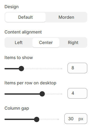
Design : Select from two available collection card designs.
Content alignment : Adjust the alignment of the content within the collection card.
Items to show: The number of items to show.
Items per row on desktop: The number of items displayed on each row in the grid layout can be customized to suit your preferences and the overall design of your site.
Column gap: The spacing between each column pair
Pagination#
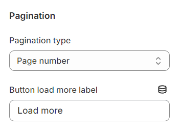
Pagination type : Choose from three pagination options: page number, load more button, or infinite scroll.
Button load more label : Customize the label on the 'load more' button.
Section padding#
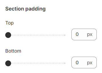
Section padding allows you to specify the space between this section and the preceding or following sections, or both.
Block settings#
For collection items, you have the capability to configure the following elements:
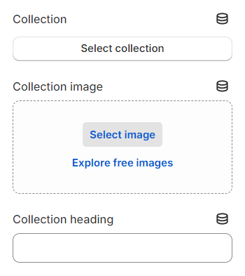
Collection: Select which collection to display.
Image: Choose or upload an image associated with the collection.
Collection heading: Define the title or heading of your collection.
Last updated 1 year ago